What is wrong, observability?
Observability dashboards were designed for the person who builds them, not the person who reads them during an incident. I argue that we need a complementary observability tool.
 Pradip Caulagi
Photo by Sylvain Mauroux
In one of my previous roles we ran GlusterFS on OpenShift. Most problems yielded to our runbooks and scripts. When they did not, we called the person who had set it up. Our F5 load balancers were the same story. Two or three people knew them well, and things went faster when they were in the room.
That is not a bad setup. It is how open source works too.
Given enough eyeballs, all bugs are shallow.
Even Rust and Kubernetes have a handful of people responsible for each component. curl, one of the most used programs in the world, is maintained by one person.
But I digress. Let's start with a definition, so we are thinking of the same thing.
Observability is being told if when things break, as soon as they break, with
enough information to name the root cause or a good hypothesis. And that information
has to reach everyone on the team.
Chapter 1: Just click and drag!
We have all seen dashboards like the one above. They are easy to make: write a query, drag a panel into place. A new data source is a few clicks. So are users, Slack and PagerDuty. That ease of use is exactly what is wrong with them. Every editable thing in that UI is a problem the tool now has to solve. None of those problems are about your system.
-
State Because the dashboards are editable, the tool needs a database. Now someone owns backups, encryption and what happens when two people edit the same panel. None of this is about observing your system. It exists only because the UI is where the dashboard lives.
-
Shadow permissions Because the dashboards are editable, the tool needs its own answer to who may change what, plus an audit trail of who changed it. Your company already has that answer: Kubernetes RBAC and cloud IAM. Now there is a second copy, kept in the observability tool, that drifts from the first one as people join, leave and change teams.
-
Forest for trees Because the dashboards are editable, there is no way to state what we want and let the tool work it out. What we want is one line. Are there deadlocks in Postgres? Is anything returning errors it did not return yesterday? Instead we describe how to draw it: which panel, which row, which data source, who may see it. The intent is a sentence, buried under a hundred settings about placement.
Chapter 2: Maya tagged you on TikTok?
We have a tool that watches the system and is the first thing we reach for when something breaks. Getting told is the solved part: PagerDuty wakes the on-call, and Slack tells the rest of the team. What arrives is one line.
Is it the database, the last deploy, one customer with a bad script, or the usual Monday spike? The answer is on the dashboard, and the dashboard is on a desk. The person holding the phone has a headline. The person at a desk has the story. Everyone else waits for one of them.
Toyota solved this on a factory floor decades ago. Any worker on the line can pull the andon cord when they see a defect. The cord is not the clever part. Every factory has a way to stop the line. The board is the clever part. It lights up above the line and shows the whole floor which station and what kind of defect. The nearest person walks over already knowing what they will find. The line stops only if they cannot fix it within a minute or two, and most pulls never get that far. The problem is not routed to a specialist. It is shown to everyone, with enough detail for the nearest pair of hands.
Knight Capital had the cord and not the board. On the morning of 1 August 2012 their trading system sent 97 emails warning that a routing flag was misconfigured. The emails went to a handful of people. None of them read the messages as an alert, because nothing in them said what would happen next or what to do. Forty-five minutes after the market opened the firm had lost 440 million dollars. By the end of the year it no longer existed. The warning was there. What was missing was the picture behind it, in front of someone who could act.
That is the difference between minutes and hours. Not everyone needs to start solving the problem. But everyone who could solve it needs to see it, wherever they are, on whatever they have in their hand.
Our observability tools deliver the summary to the phone and keep the picture at the desk. The graph that says which service is on fire lives in a browser tab, behind a login, in a layout designed for a 27-inch screen.
Chapter 3: One universal standard number 14
I have been working on a new tool based on the ideas above. It is declarative, and it is built for phones: your Prometheus metrics, on the go. It does not replace the need for logs and traces. Vedavid is the view you open on your phone between the page and the desk: declarative, read-only, and built for one screen.
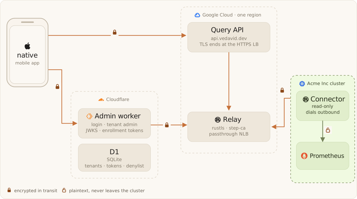
It has three parts. The connector is a small open-source program that runs inside your Kubernetes cluster. It reads your dashboard definitions, fetches the matching metrics from Prometheus, and sends the results out. It needs no special cluster permissions and never accepts incoming connections. It only reaches out. The relay is a service hosted by vedavid that sits in the middle. It connects each phone to the right cluster and makes sure users only ever see their own organization's data. The iOS app is where engineers view dashboards. It is deliberately read-only. You look at dashboards on the phone, but you never build or edit them there.
Dashboards are written in a small, declarative YAML DSL and kept in git alongside the rest of your infrastructure, so they are reviewed and versioned like code. This is not a copy of every Grafana board. It is the short list of things you check when paged, written down once. The files declare what to show, not where to put it. The phone decides how to lay it out for a small screen.
Vedavid focuses only on metrics. It leaves out logs, and traces so it can do one job well: a fast, clear view of what is happening when you get paged.
I'd love for you to try vedavid. There is no cluster to set up and no connector to install.
- Install the iOS app from TestFlight.
- Sign in with your Gmail address. You land in a live demo with real dashboards.
- Tell me what worked, what confused you, or if it's a terrible idea. All three count.
I read and reply to every message. 🙏🏻 🙇♂️
Happy to hear your thoughts — disagreements first, applause ok.